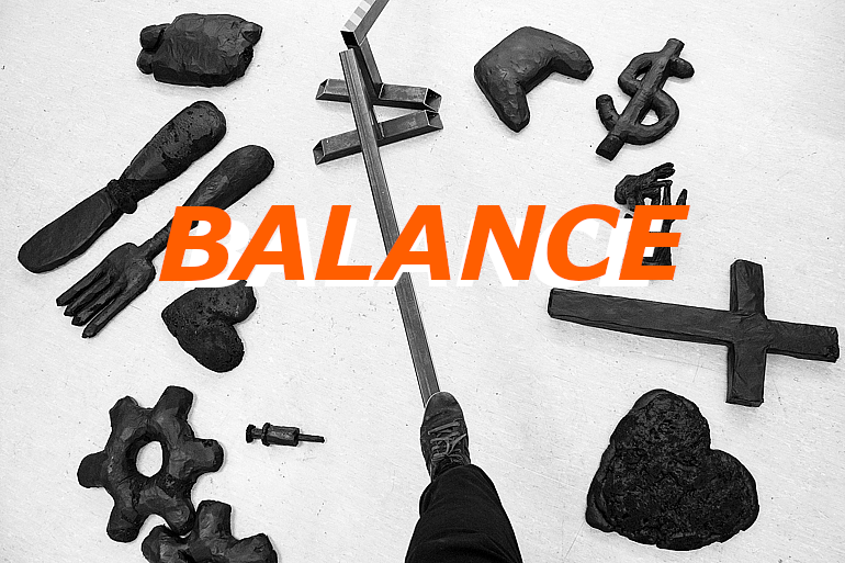
Details about the making of the interactive installation Balance (2020).I moved frequently over the last ten years and changing the places and communities meant that finding balance while navigating through life was more often challenging than not. Then, one of my hobbies is slacklining (tightrope-walking-like sport). These factors, together with the wordplay in my previous artworks, such as Burnout (2016), and Bikes Make Dresden (2018), started shaping the idea for this project: Create an environment that would allow people to find balance - literally, by balancing over scenes from life. While the initial plan looked simple, it took a lot of refinement to materialize it. Some early sketches involved chains, mirrors, and video-mapped projections.
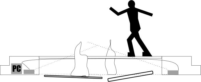
Drawing of one of the early versions.
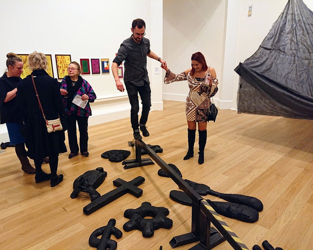
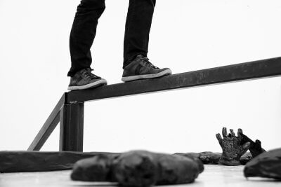
The main challenge of the development stage was to enhance the user-friendliness of the work while keeping the production costs at a sustainable level. I replaced the chains with a solid beam and opted to drop any electronics by representing the topics by sculptures, rather than projections. Once the rough form of the project was clear, it still required addressing plenty of details. Due to the interactive nature of the installation, the main concern was to make it safe and welcoming, yet challenging. If the walking beam is too narrow and/or too high, nobody would want to participate. On the other hand, if it is too wide and/or too low, it would deny the idea crucial to the concept. Besides the width and height, I had to find a suitable material for both the walking platforms and the sculptures. Material-wise, I went with steel, to make the platforms as sturdy as possible.
After cutting, welding, and grinding the steel, I had three pieces for the balancing: two ramps and one central beam. Then I applied anti-slip rubber to the contact points with the ground to make the pieces more stable and to prevent accidental floor damage. To finish, I added grip to the ramps, increasing their visibility and preventing anyone from slipping.
With the balancing platforms done, I moved to the sculptures. My initial thoughts about the material were concrete or wood, but these were quickly scrapped after going through the risk assessment. Imagining scenarios of potential injury caused by a sculpture representing health, for instance, wasn’t desirable, so I set off to make them low-profile, soft, and round. “Sand could do,” I thought. But that was a no-go as well — sand could hold moisture, and could, therefore, ruin the gallery’s wooden floors. Polystyrene would work but is surprisingly expensive. After making the steel platforms, my budget needed to be in balance, too. I recalled the days I worked in construction and had a solution: Polyurethane foam.
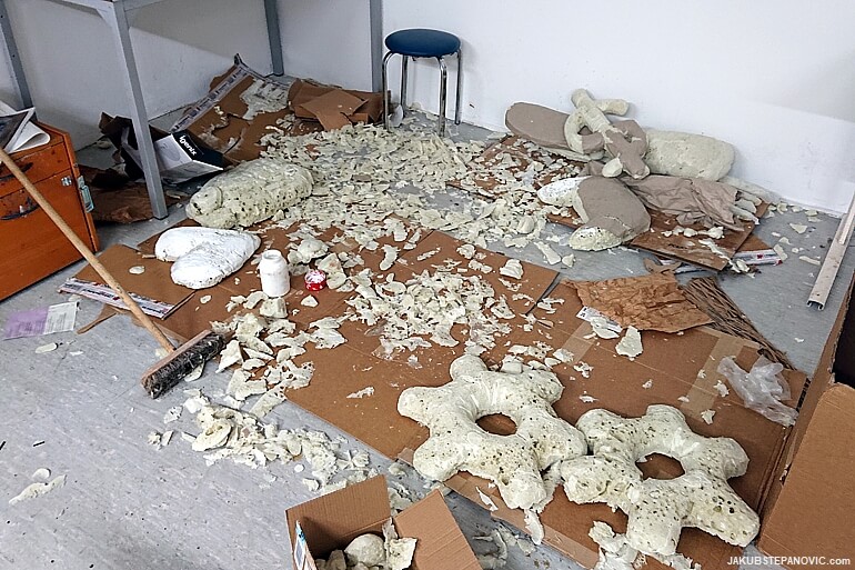
The pieces start to take shape.
I smoothen parts of the sculptures' surface with a filler or newspapers and wallpaper glue. Other parts I left untreated, admitting the material and exposing its roughness — to highlight that some areas can have imperfections even when balanced. The last thing was to paint the sculptures to match the color of the steel platforms: three coats of matt black.

The work was exhibited in the Royal Scottish Academy in the Scottish capital, Edinburgh.
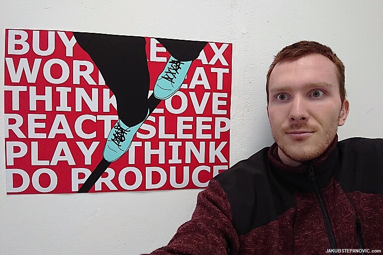
I also made a Balance-themed poster to accompany the work, which ended up being featured on ArtMag.co.uk as a cover for the show. Happy days!
Update, April 2023: I built a new version of the artwork; you can read more about it here. Balance lives on. Thanks for reading!

Comments are closed.